

My own kitchen experiences have been varied: growing up, it was a small, and then a large gathering place when my family moved. In college, kitchen design was never an option (though we did get new cabinetry my senior year). Since college, I've had one medium-sized kitchen, followed by two small galleys. I've been jealous of Ted's kitchen since I first saw the show.
 |
| Special thanks to sweet nothings for sharing pics from her visit to the set! |
First off, props to the set dressers for making Ted's kitchen look like something people actually use. It's cluttered, but not terribly so. It's full, and not staged, which is nice. I'd rather look at a kitchen from a TV show than a kitchen from a home design magazine any day of the week.
The first thing that strikes me is how huge this kitchen looks! In "reality", it's not huge at all. It's as regular as a kitchen in a rental unit can be - not a whole lot of counter space, a mild and neutral color palette, non-matching appliances - and yet, the renters have made it their home.
Now, where to get started...
Color
Neutrals, but we've covered that. I'll do my best to match the Behr or Dutch Boy paint colors - they're the brands I'm the most familiar with, have the coolest names, and have proven themselves through my use and through legitimate vouches (the painters on Holmes on Homes use Behr). The colors that I've found that most closely match are:

The Floor
The floor appears to be something very simple - vinyl floor tile. I've been seeing it make a resurgence in recent years, since it's typically an inexpensive material, it's durable, and it's easy to replace if need be. Black and white checkered is a classic pattern that never goes out of style.
The Countertop
1) It matches the floor... mostly.
2) There isn't much of it.
White tile with a black edge is a very clean look. The colors match the floor, and make a nice break in the room. These countertops are something I'm incredibly used to - rental unit, not a whole lot of counter space. After using up that corner for storage, they really only have the area in front of the pass-through (to the left)
The Cabinets
Obviously painted - and Behr's Antique White is the best choice. The other things to notice are the hardware, the fronts, and the backs.
Since cabinet hardware can sometimes be one of the most expensive parts of a renovation, I'm going to the old trusty sources for inexpensive hardware.
IKEA's KOSING are nice, round knobs in a chrome. Granted, the knobs in Ted's kitchen are black, but chrome is another accent in the lighting, so it wouldn't be out of the question.
Target - believe it or not - carries decent cabinet hardware as well. Their Amerock Colonial knobs in black match the kitchen pretty perfectly, and are about a dollar a piece ($3.99 for a 4-pack).
The lower cabinets have a full front, however, the upper cabinets have a nice glass front. I'm all for this idea. It looks like they use their upper cabinets for food storage (check out the iconic Campbell's soup labels above the dishwasher), and this strategy would definitely force you to keep your cabinets more organized and good-looking. Also, having glass-fronted uppers makes a kitchen look bigger and fuller when it may not be.
It also looks like, while the cabinets themselves may be a wonderful antiqued white color, the cabinet backs appear to be painted with a bit more of a peachy color. It could be a trick of the light, but personally, I like the idea of having a third color in there.
The Appliances
First - and wonderfully - they don't match. Not even a little. But they do show a history of the apartment. The stovetop/oven/range combo looks to be from the 1940s, the fridge maybe from the 50s or 60s, and the modern stainless steel dishwasher and black microwave tucked in the corner bring us to today.
The Details
Finally, the details. One of the things I love about the character of Ted is his passion for the history of things. The whole point of the show is that he wants his kids to know exactly how he met their mother - and refuses to leave anything out. (Okay, that's not true. There's that story that Victoria told in Season 1, the joke of Barney's from Season 4, and his substitution of "sandwiches" for joints and "bagpipes" for loud sex... but you get the idea.) It's the details that make this kitchen. The vintage-looking tin signs, the big chrome light over the sink, the little towel bar for washcloths and spice rack next to the range, the red tea kettle, even the oversized utensil jar on the stovetop. I like to look at the spirit of something, and go from there. So in the spirit of this kitchen, here's a couple of my picks from Etsy:
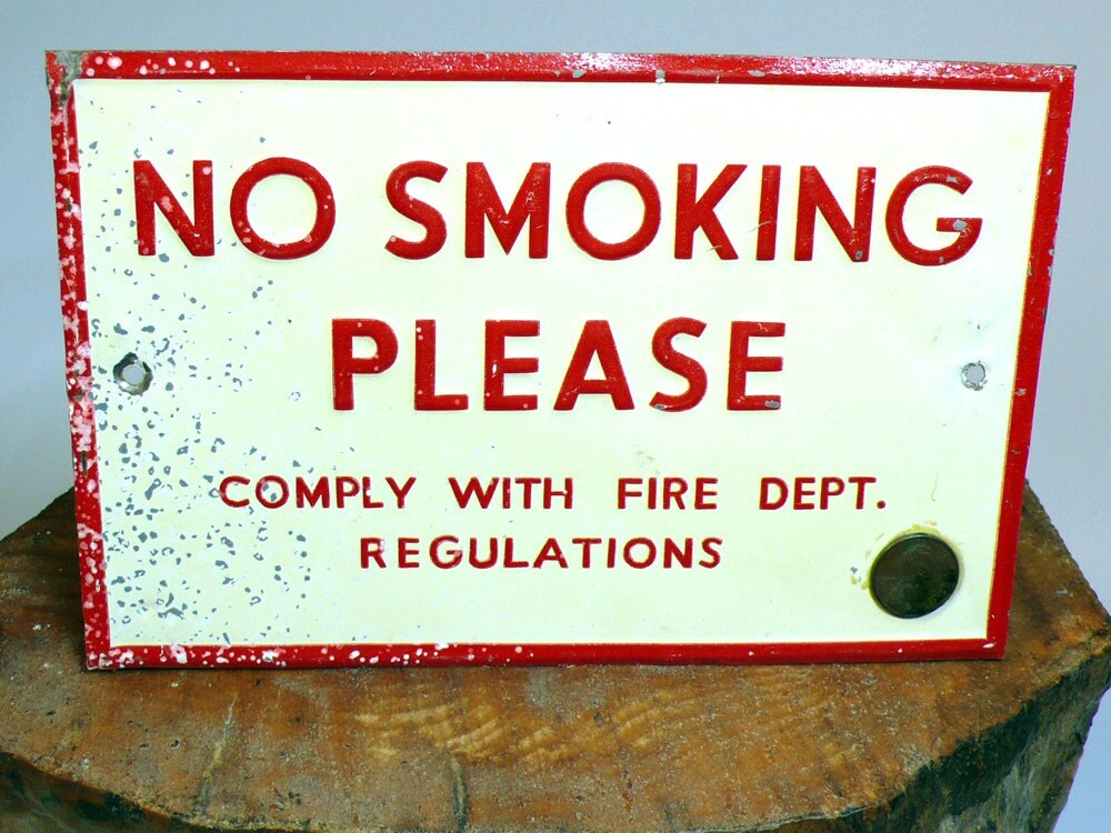 |
| Vintage Industrial Metal Red and White... by SugarCubeVintage |
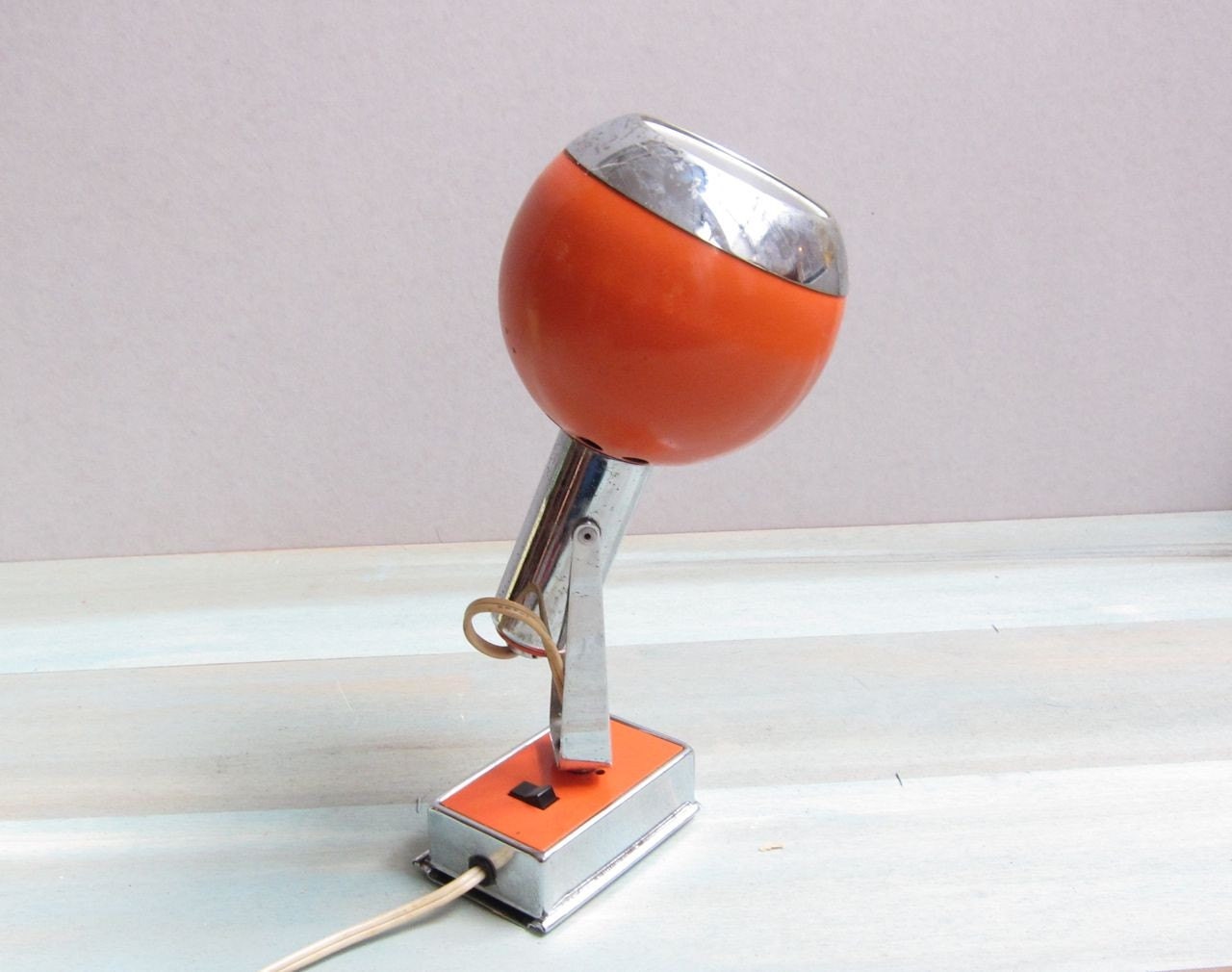 |
| Mid Century Sconce Lamp by claireferrante (for that pop of orange over the sink) |
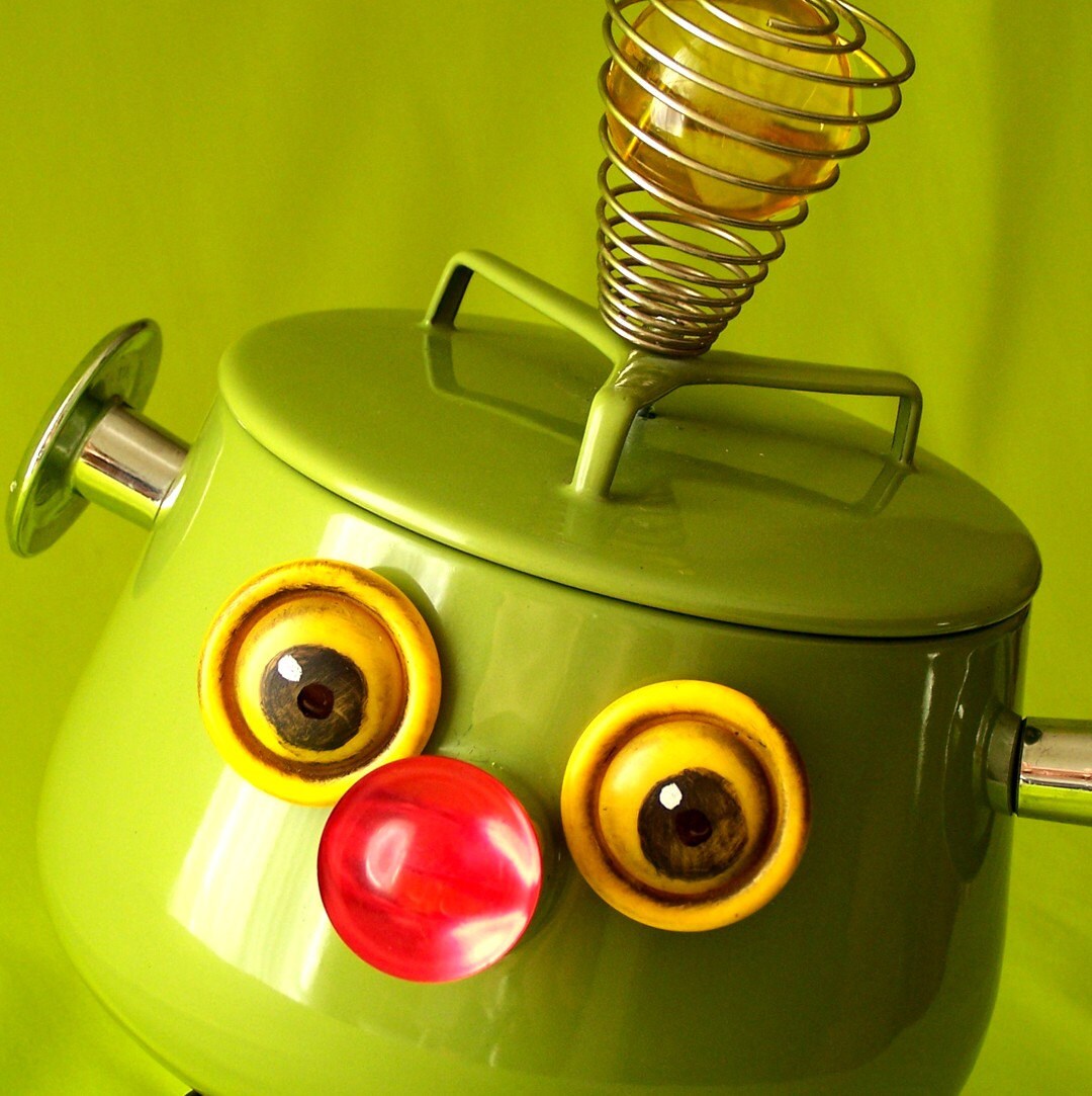 |
| LYLE Snack Server / Cookie Robot by reclaim2fame (Every kitchen needs an R2-SweetTooth!) |
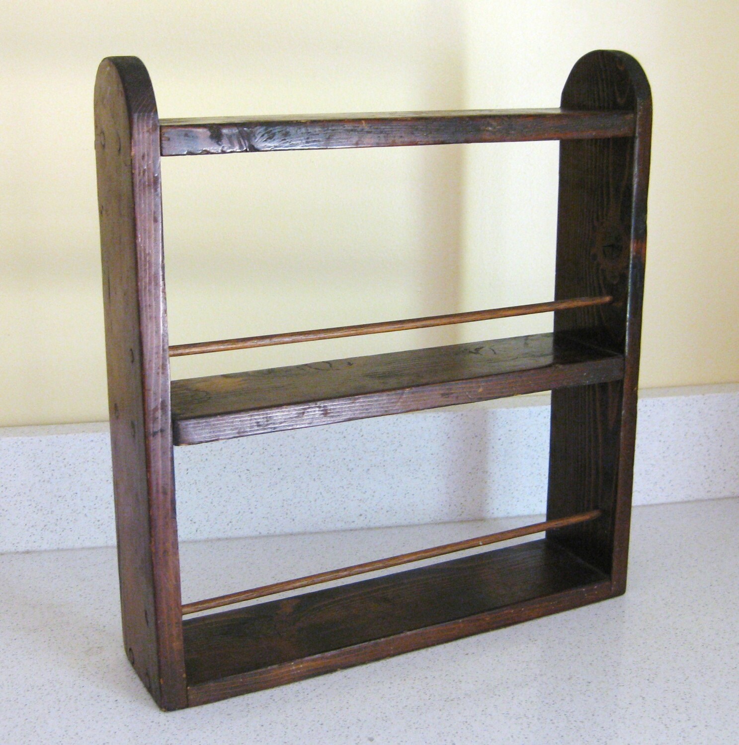 |
| Vintage Wooden Spice Rack by lemontreefarm |
 |
| Mosaic Serving Tray - Retro Blues by rushcreekmosaics (made in Ohio - just like Ted) |
And one more IKEA pick:
 |
| KVOT Dish Drainer |
I think that about exhausts me. Beyond that, I'm full-on copycatting. I really do love this show, and the design of the kitchen - and the accuracy of it! - plays but a small part in that. One more thing - check out beanforest on Etsy for magnets. They're little and kitschy... and just the thing that would be at home in Ted's kitchen.
Hi! We share common interests. HIMYM is my favourite show + I love Ted Mosby's kitchen too!! Love love the colour & the tiles they used as the counter top. I'm in the midst of remodeling my own kitchen & was looking for pictures from the show when I came across your blog. Good work, by the way & keep it up!
ReplyDelete